HMI Design Best Practices for Operators
HMI design is the planning of the screens operators use to monitor and control a process. Good practice, set out in ISA-101, uses a four level display hierarchy, muted grey backgrounds, colour only for abnormal conditions, values shown against normal ranges and trends, consistent navigation, and a well managed alarm system.
A human machine interface (HMI) is the operator’s window into a plant. Good HMI design helps an operator see at a glance whether the process is normal, notice problems early and act correctly under stress. Poor screens, crowded with bright colours, 3D pumps and raw numbers, have been identified as a contributing factor in industrial incidents. The guidance below follows ISA-101, the High Performance HMI Handbook and alarm management standards.
Why HMI design matters
Operators spend most of their shift watching a process that is running normally. Their job is to detect small changes before they become upsets. A screen that looks like a colourful piping drawing gives data, but not information: the operator has to read each number and remember whether it is good or bad. High performance HMI design shifts this mental work to the display, showing values in context so that abnormal conditions stand out without reading every number.
HMIs are part of the wider control system. Their place in a plant network is covered in SCADA system architecture and DCS architecture.
The HMI design lifecycle
ISA-101 treats the HMI as a system with a lifecycle rather than a set of drawings:
- HMI philosophy: the high level principles for the site, such as the purpose of each display level and the use of colour.
- Style guide: detailed rules for colours, fonts, symbols, layouts, navigation and alarm presentation.
- Toolkit: a library of approved objects (faceplates, indicators, trends) built to the style guide.
- Design, implementation and testing: displays built from the toolkit, reviewed with operators and tested before use.
- Operation and management of change: a controlled process for changes so that screens stay consistent over the life of the plant.
Display hierarchy in HMI design
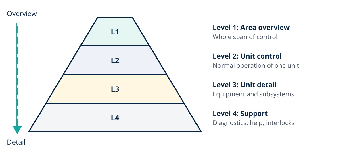
ISA-101 organises displays into four levels:
- Level 1, area overview: the operator’s whole span of control on one screen, often on a large wall display. It shows key performance indicators, major flows and any abnormal conditions, but is not used for control actions.
- Level 2, process unit control: the main working displays for normal operation of one unit, such as a distillation column or a boiler, with the controllers and trends needed for routine tasks.
- Level 3, process unit detail: detailed displays of equipment and subsystems used for non routine tasks, start up, shutdown and troubleshooting.
- Level 4, process unit support and diagnostic: interlock logic, instrument diagnostics, help screens and procedures.
Navigation should let the operator reach any Level 2 display in very few clicks, and should be the same on every screen.
Visual design best practices
Colour
- Use a light or medium grey background and show equipment and piping in low contrast grey.
- Reserve bright, saturated colours for abnormal conditions and alarms, and never reuse alarm colours for anything else. If red means a high priority alarm, a running pump should not also be red.
- Do not rely on colour alone. Roughly 1 in 12 men has some form of colour vision deficiency, so alarm states should also differ in shape, text or position.
Showing values in context
- Use analog indicators that show the current value against its normal operating range and alarm limits, so the operator can see “normal” without reading the number.
- Show important variables as trends with fixed, sensible scales. The direction and speed of change often matter more than the current value.
- Group related values and present calculated information, such as efficiency or margin to limit, where it helps decisions.
Layout and text
- Arrange the display to match how the operator thinks about the process, usually left to right in the direction of flow.
- Use plain fonts, consistent units and abbreviations, and avoid decorative 3D graphics and animation of normal states, such as spinning pumps, which add movement that hides real changes.
- Keep the display uncluttered, with white space to separate groups.
Alarms and HMI design
The HMI is where alarms are seen, so alarm management and HMI design go together. ANSI/ISA-18.2 and EEMUA 191 define three or four priorities, require each alarm to need an operator action, and give benchmark rates for one operator position:
| Metric (per operator position) | Very likely acceptable | Maximum manageable |
|---|---|---|
| Alarms per day | about 150 | about 300 |
| Alarms per hour | about 6 | about 12 |
| Alarms per 10 minutes | about 1 | about 2 |
An alarm flood is defined as 10 or more alarms in 10 minutes for one operator. A typical priority distribution target is about 80% low, 15% medium and 5% high. Alarms should appear in a dedicated alarm list and as indicators on the process displays, with a consistent link from one to the other.
- Given
- The alarm log for one console shows 2016 annunciated alarms over 7 days of continuous operation.
- Find
- The average alarm rate per day, per hour and per 10 minutes, compare it with the ISA-18.2 benchmarks, and find the reduction needed to reach about 150 alarms per day.
- Assumptions
- One operator position; alarms evenly spread for the averages (floods are checked separately).
- Solution
- Per day: 2016 ÷ 7 = 288
Per hour: 288 ÷ 24 = 12
Per 10 minutes: 12 ÷ 6 = 2
Required reduction: (288 − 150) ÷ 288 = 0.479, about 48% - Answer
- 288 alarms per day (12 per hour, 2 per 10 minutes), at the maximum manageable level; about 48% fewer alarms are needed to reach the very likely acceptable rate
- Limitations
- Averages hide floods; the log should also be checked for 10 minute periods with 10 or more alarms, chattering alarms and the most frequent alarms, which usually give the quickest reduction.
Applying HMI design on an existing plant
Many plants have HMIs that grew over years without a style guide. A practical upgrade path is:
- Write an HMI philosophy and style guide with operators, engineers and management.
- Rationalise the alarm system first, because a good display cannot fix an alarm flood.
- Build a toolkit of standard objects in the SCADA or HMI software.
- Redesign Level 2 displays for the most important units, then Level 1 overviews.
- Test new displays with operators, ideally on a simulator or digital twin, and train before switching over.
- Control later changes through management of change so that the style guide is followed.
Field data reaches the HMI through the PLC or controller, often over protocols such as Modbus RTU and TCP, so tag names and descriptions should be consistent from the PLC program to the display.
HMI design interview and viva questions
- What are the four display levels in ISA-101? Level 1 area overview, Level 2 process unit control, Level 3 process unit detail and Level 4 support and diagnostic displays.
- Why should colour be reserved for abnormal conditions? If normal equipment is shown in bright colours, alarm colours lose their meaning and abnormal conditions do not stand out.
- What is an analog indicator and why is it preferred to a plain number? It shows the value against its normal range and alarm limits, so the operator can judge whether it is normal at a glance.
- What is an alarm flood? It is 10 or more alarms in 10 minutes for one operator position, a rate at which operators cannot respond properly to each alarm.
- What is the role of an HMI style guide? It sets detailed rules for colours, symbols, fonts, layouts and navigation so that every display in the plant is consistent.
Frequently asked questions
What is a high performance HMI?
A high performance HMI is an operator interface designed to support situation awareness rather than to look like a detailed process drawing. It uses muted grey backgrounds, reserves bright colour for abnormal conditions and alarms, shows values in context with normal ranges and trends, and organises displays in a clear hierarchy. The approach is described in the High Performance HMI Handbook and is consistent with ISA-101.
Why are HMI backgrounds grey instead of black?
A light or medium grey background reduces glare and eye strain in a control room, and it lets alarm colours such as red and yellow stand out clearly. Black backgrounds with bright coloured lines and equipment make every object compete for attention, so a real abnormal condition is harder to spot.
Which standard covers HMI design?
ANSI/ISA-101.01-2015 Human Machine Interfaces for Process Automation Systems covers the HMI lifecycle, philosophy, style guide and display hierarchy. Alarm presentation and alarm rates are covered by ANSI/ISA-18.2 and EEMUA 191, and control room layout by the ISO 11064 series and EEMUA 201.
References
- ANSI/ISA-101.01-2015, Human Machine Interfaces for Process Automation Systems, International Society of Automation
- ANSI/ISA-18.2-2016, Management of Alarm Systems for the Process Industries, International Society of Automation
- EEMUA Publication 191, Alarm Systems: A Guide to Design, Management and Procurement, 3rd ed., Engineering Equipment and Materials Users Association
- B. Hollifield, D. Oliver, I. Nimmo and E. Habibi, The High Performance HMI Handbook, PAS
- ISO 11064 series, Ergonomic design of control centres, International Organization for Standardization
- EEMUA Publication 201, Control Rooms: A Guide to their Specification, Design, Commissioning and Operation, 2nd ed., EEMUA
Get one engineering email a week
New articles, worked examples and study notes every week. Free, no spam, unsubscribe any time.